From My Portfolio: Ness Nite

This was a super fun and creative project for me to work on. It definitely pushed me to create a really cool and unique design that’s unlike anything I’d ever done before.
Ness Nite is a 22-year-old music artist with her own unique sense of style. She coined the term “braless music” because her music is a kind like no other, following no rules. She’s an up and coming artist with notable press features (she already been featured in Vogue Russia…at 22!), and she has a devoted and growing fan base.
She wanted her website to feel welcoming for her fans and to show off her style and personality. As the web designer, I knew the website also needed to influence fans to purchase her latest album and to sign up for her email list to be notified of the latest shows and music, too.
We started the process by creating her mood boards. I always provide two mood board options to begin a project, once a client provides me with photography/design samples and once they complete my questionnaire to help me understand their preferences.
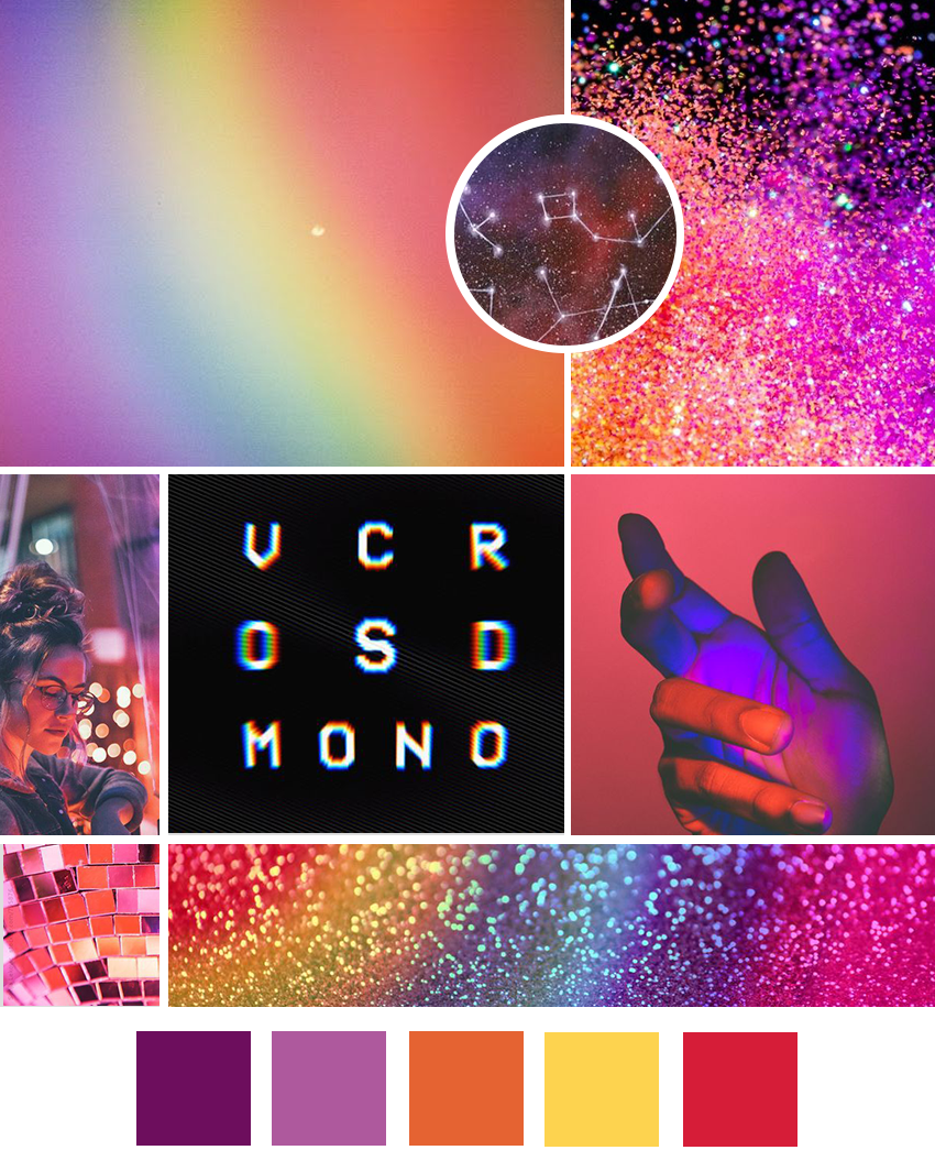
They wanted a bold website with some purples and pastels and maybe every some cosmic aspects, since Ness was really into astrology. The favorite mood board was the second one, but they requested that more oranges and reds be added to it to make it a bit less feminine.

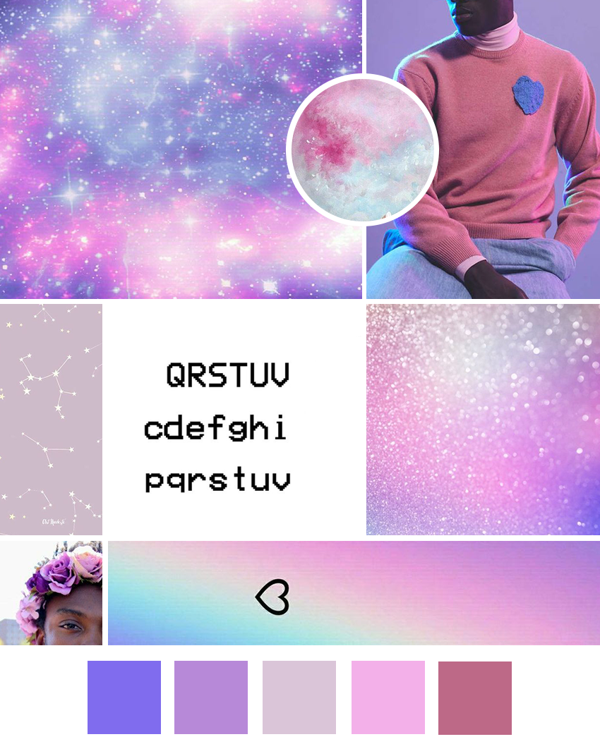
I ended up with this finished product for the mood board below, once I added the red and orange. The mood board step is always my favorite because it sets the tone for the rest of the project!
Once the mood board was all done, I started on the logo designs. There were several variations that we started with and we ended up settling on the one below, with the letter ‘N’ shaped like a constellation in deep purple, with her name underneath in black. It was a great choice because it’s versatile and can be used on many different background colors.
The image below is the brand board. In addition to the logo, it also has a logo variation. The logo variation condenses the logo design a bit, in case they need one for a smaller space. I also included the color palette, along with the selected fonts. They requested a “camcorder” style of font to be used in the headings on the website. This is the same font that’s used for “Ness Nite” in the logo. So that was selected for the main font. For the second font, to be used in paragraphs, I selected a sans serif font, called News Gothic. It was clean and simple to compliment the heading font.
The brand board also contained submarks to be used for the favicon or other areas where a little accent mark may have been needed. And last but not least, I also included patterns that could be included in the designs. They loved glitter and rainbow patterns, so I was sure to include those.

Next up was the social media branding! As part of my package, I design social media banners that will match the brand design. I created one for Ness’s YouTube channel, Facebook page, and Twitter page.

My next step was to create a mockup of Ness’s homepage in Photoshop. This allows me to plan where each item on the website will be placed and to decide which patterns will be used where. I ended up deciding not to use the glitter. Instead, I created a deep purple constellation background for use in certain areas. I also created a clean, yet colorful background consisting of shapes, like circles and triangles for some sections. And finally, I definitely had to incorporate the rainbow in some sections. Even though they’re all different, they worked together beautifully.
I was sure to include links to her Spotify music page and to her album purchase page at the top of the homepage to encourage more clicks to those important areas. I also ended up adding a link to purchase her album to her main navigation bar, so no matter what page someone was viewing on the website, they’d be able to click to purchase the album easily. We don’t want people to have to hunt for that link. And finally, I included the newsletter subscription box in the footer area so that would appear on every page. With that on every page, people are more likely to sign up because they’ll be seeing it more frequently.
Ness and her team loved it once I revealed it to them and I moved on to the website build!

To see the final website, click the screenshot below! The various pages on the site are all so fun and unique so definitely check it out. Also, check out Ness’s music while you’re at it! :-)

I received this wonderful testimonial from Ness’s manager, Tylah, who was my primary contact during the project:
“Keshia was fantastic and delivered everything with plenty of time! During the consultation video call, I liked being able to see her face and she was so warm and welcoming that I trusted her pretty immediately. I loved that each step was tracked out at the beginning of the process, so there was no guessing about progress. The design will create a very personal brand identity that will help people gain an understanding of Ness as an artist. For someone considering hiring Keshia, I’d say DO IT. Keshia is thorough, kind, and so easy to work with. Her communication is phenomenal and timely. She produced an end result that really fit our vision.”
If you’d like to learn more about my website and brand design services, please check out my services page here. I’d love to design something unique and AMAZING for you, too!

