5 Quick Steps for Organizing Your Homepage for Better Results
Having an organized website can make the difference between people staying on the website to learn more about your products or services or deciding to keep it moving to the next app that’s buzzing on their phones. If you’re taking the DIY route for your site, strategically organizing it is something that can easily be overlooked.
When I first started blogging, I knew nothing about web design, but I still opted to work on my own website (hey, it was fun to experiment with it, ok? lol). However, strategically organizing my site wasn’t something that I thought much about, at the time. Sure, my website had the basics, but it lacked the strategy behind it to help me get the results that I was going for.
Once I started taking web design courses, I learned about wireframing. I had literally never heard the word ever before in life, but it helped me to plan my website in a way that would get better results and that would make it more user friendly. Simply put, wireframing is just planning out which elements will be placed where on your website, based on how important they are. Wireframing also helps to ensure that you design a website that provides a great user experience for visitors, making it easy to understand and navigate.
Wireframing can be done with quick sketches using pen and paper or in Photoshop, if you have it. For every website that I design, I create the wireframes first. I start with pen and paper sketches and then I translate those into Photoshop, so I can present them to clients to show them how I’m planning to lay out their websites. If you’re doing this on your own and you don’t have Photoshop, using pen and paper is perfectly fine. The wireframes are just providing you with a template to follow as you create your website, so instead of just placing elements randomly, you’re able to go in with a plan.
Below, I explain the 5 steps to organize your website homepage using a wireframe. Keep in mind that these same tips can be applied to any pages on your website. You can do all of this by drawing out squares that represent photos and signup forms and lines that represent text.
Step 1: Start with the top of the web page.
Think about what you would want people to first notice when they land on your website. Usually, this is a large banner image with a call to action or a tagline about your business. For service-based businesses, it usually leads to an email signup form. If you’re a blogger, it may be a large image that leads to one of your most recent blog posts. Think about the most important action that you want someone to take and the first impression that you want to make. Draw the rectangle at the top of your page to represent the photo and draw lines to represent the text. Of course, you’ll have your navigation bar at the very top with your logo and you could also include social media links or a search bar. But people’s eyes gravitate there second, after first looking at the banner image.
Step 2: Think of the actions that you’d want people to take if they didn’t immediately click on the banner image.
Would you want to show them what topics you blog about, if you’re a blogger? Would you want to lay out options for ways that you could serve them as a business? Would you want them to learn more about you through a quick summary about yourself and a photo? Or would you want to share an inspiring quote or something unique about you? It’s totally up to you and what you deem most important to show someone who may (or may not) be visiting your website for the first time. Here are examples of this:
If you’re a blogger, include your blog post categories. For example, your categories may be fashion, food, and travel and you could draw squares to represent images for each of those categories, with lines to represent the name of each category.
If you’re a service-based business, like a photographer for example, your options, might include wedding photography, event photography, and maternity photography, drawing squares that represent images for each of those, with lines to represent the name of each category.
If you sell products, you could include your product categories, like t-shirts, hats, and jewelry, with squares drawn to represent images that would show images to represent each each product category.
...you get the picture
Really, it helps to include one of the summary options I listed above, PLUS a bit about you. This helps you to quickly show what you provide/do, why you do it, and what makes you qualified to do it.

Step 3: Include examples.
These examples could be testimonials of your work or a preview of work in your portfolio, if you offer a service. Include a “quick shop” section with your top 6 products (3 on each row, looks clean and neat), if your business is product based. Include 3-6 of your most popular or most recent blog posts, if you’re a blogger.
Step 4: Include a call-to-action regarding your email list.
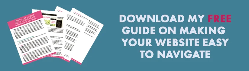
Growing your email list is crucial to solidifying your audience online now. Social media is always changing, so there’s really no substitute for an email list of contacts who you can reach directly through their inboxes with updates from you. Just be sure to offer them something in return for signing up because people aren’t giving up their emails for nothing these days. You can offer a free how-to guide, a discount code, etc.--anything that you think your audience would find valuable.
Step 5: Plan out your footer.
In the footer, there are several ways to make an exit with a bang! In this blog post, I over viewed 5 ways to spice up your footer. The one you choose will depend on what the highest priority is for you. Are you trying to connect with them more so they’ll trust you to buy your services? Are you trying to show them how many great blog posts you have? Are you trying to get more followers on Instagram? You’ll can also include your navigation bar again in the footer (if desired...it’s not necessary). And finally, you’ll definitely want to include your social media buttons, and any copyright info.
“Be sure you’re designing your website with the user in mind. Make it effortless and easy!”
That is it! Just be sure you’re designing with the user in mind. Remember that website visitors probably won’t be familiar with you or your business when they first land on your website, so you want to make things as effortless and easy-to-understand as possible for them.